Integrated Learning Platform Revamp
I spearheaded the redesign of TutorTPB's interface, creating a cohesive design system to address layout and architecture issues alongside rejuvenate appearances. Through restructuring course information, standardizing content layout, and personalizing the dashboard, we aimed to improve user experience. Initial feedback from product owners shows satisfaction with the interface, aligning with business goals and enhancing design and usability.

My Role
Lead Product Designer
Company / Client
TutorTPB
Year
2023
Tools
Figma, Google Forms
Challenges
TutorTPB is a learning center for first-year students at ITB with thousands of active users. The business goal of TutorTPB is to provide an integrated and user-friendly course platform for students.
TutorTPB continues to evolve both in terms of features and content. Alongside this progression, the TutorTPB interface is also continuously developed to enhance user experience. The interface-related issues that need to be addressed are divided into two categories:
Issues from user feedback gathered through surveys and observations, including:
Confusing syllabus structures
Users' lack of awareness of the overall content due to ineffective layout
The need to overview course content before joining, especially for new users
The need to view recent updates of course
Issues raised by the product owner concern an outdated appearance. They prefer a flat and minimalist design, specifically referencing Wise and Twitter as a design benchmark.
My Role
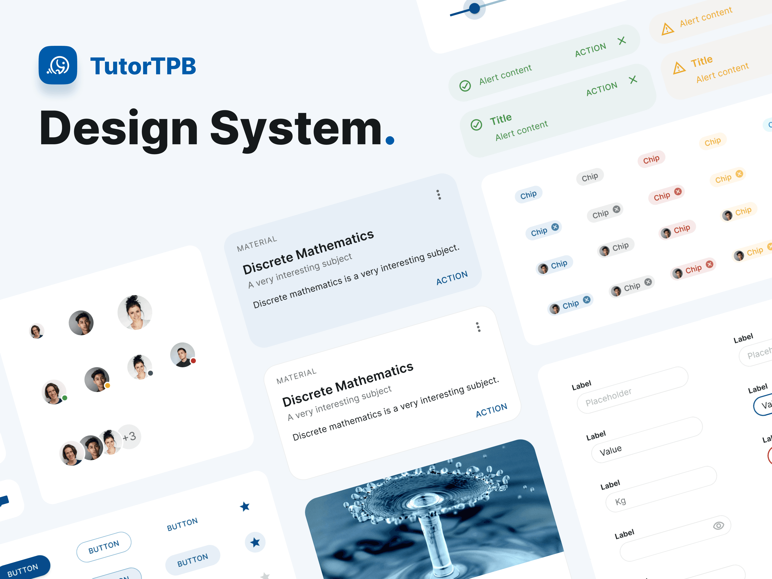
New Design System
As the lead product designer, I performed the necessary layout revamp and created a design system to be used by the design team. The steps for the revamp and design system creation are as follows:
For component completeness and standardization, I utilized existing design system components as a template (Materialize).
I used these components to create the new main TutorTPB interface layouts. During development, numerous adjustments were made to the components to align with branding and fit the new layouts.
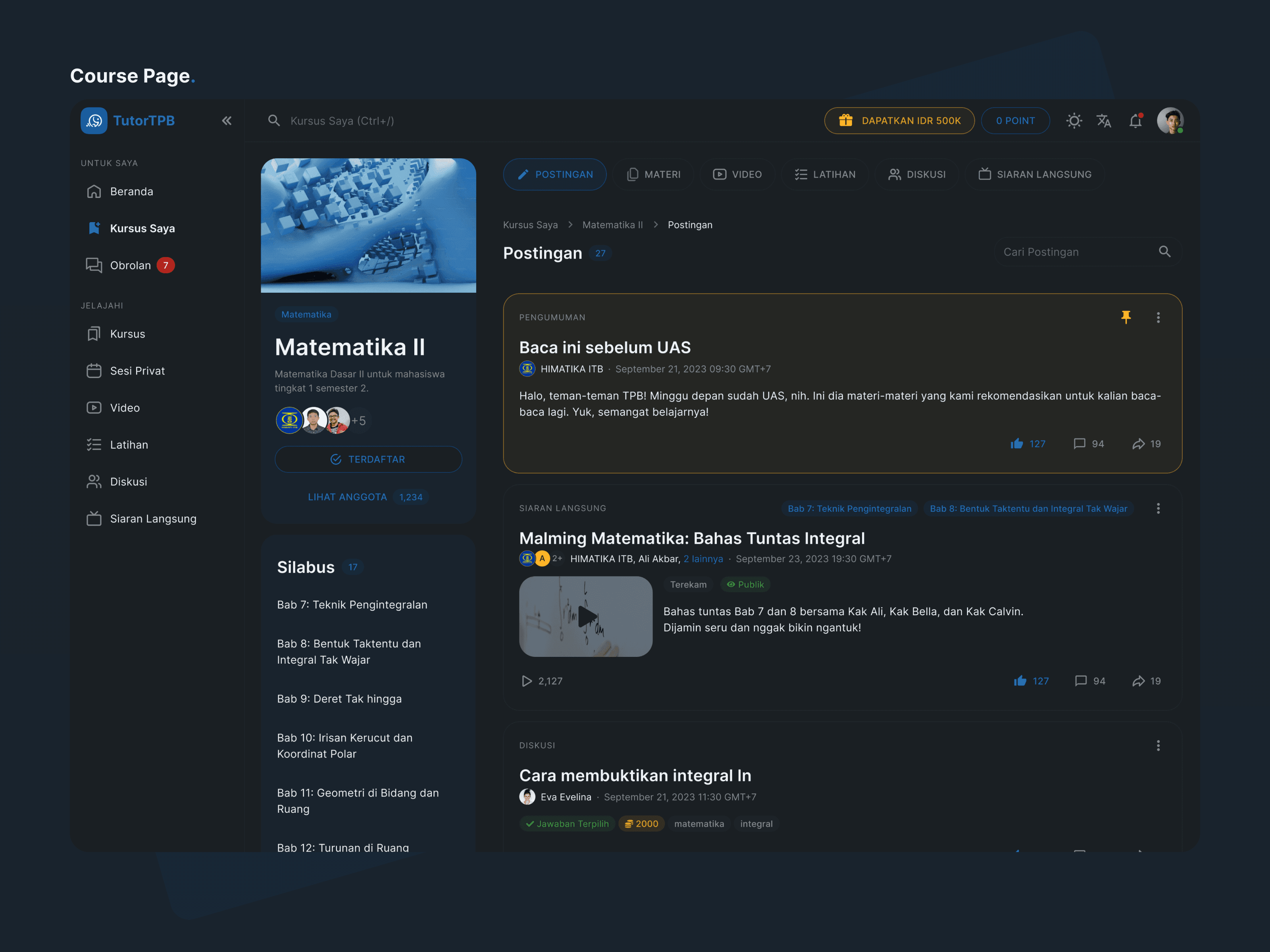
Made colors as versatile as possible to use for dark mode (mostly using color opacity to adapt to light and dark background). Currently exploring Figma variables for future usage.
All utilized and adjusted components were gathered into the new TutorTPB design system.
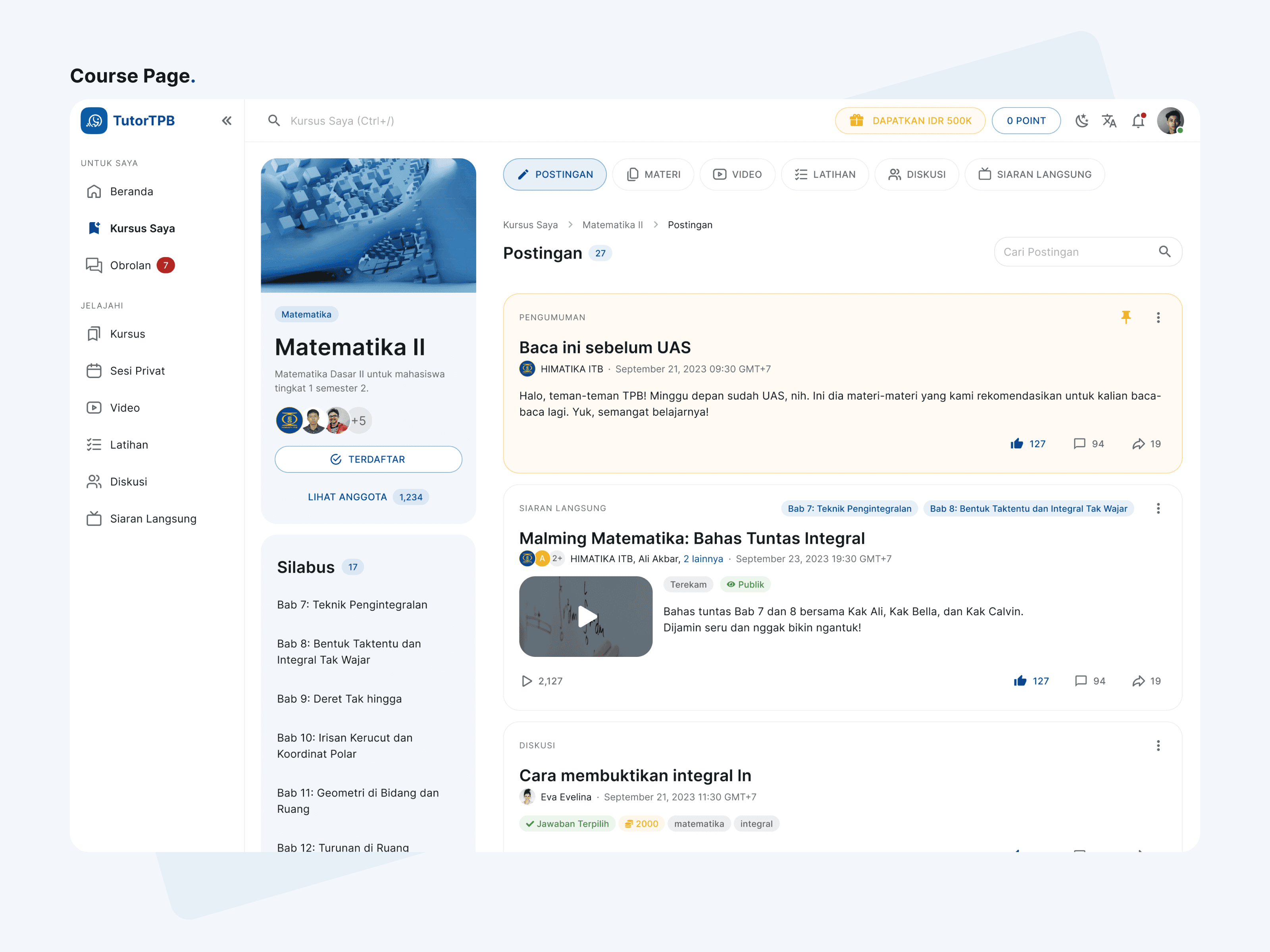
Courses Information Architecture
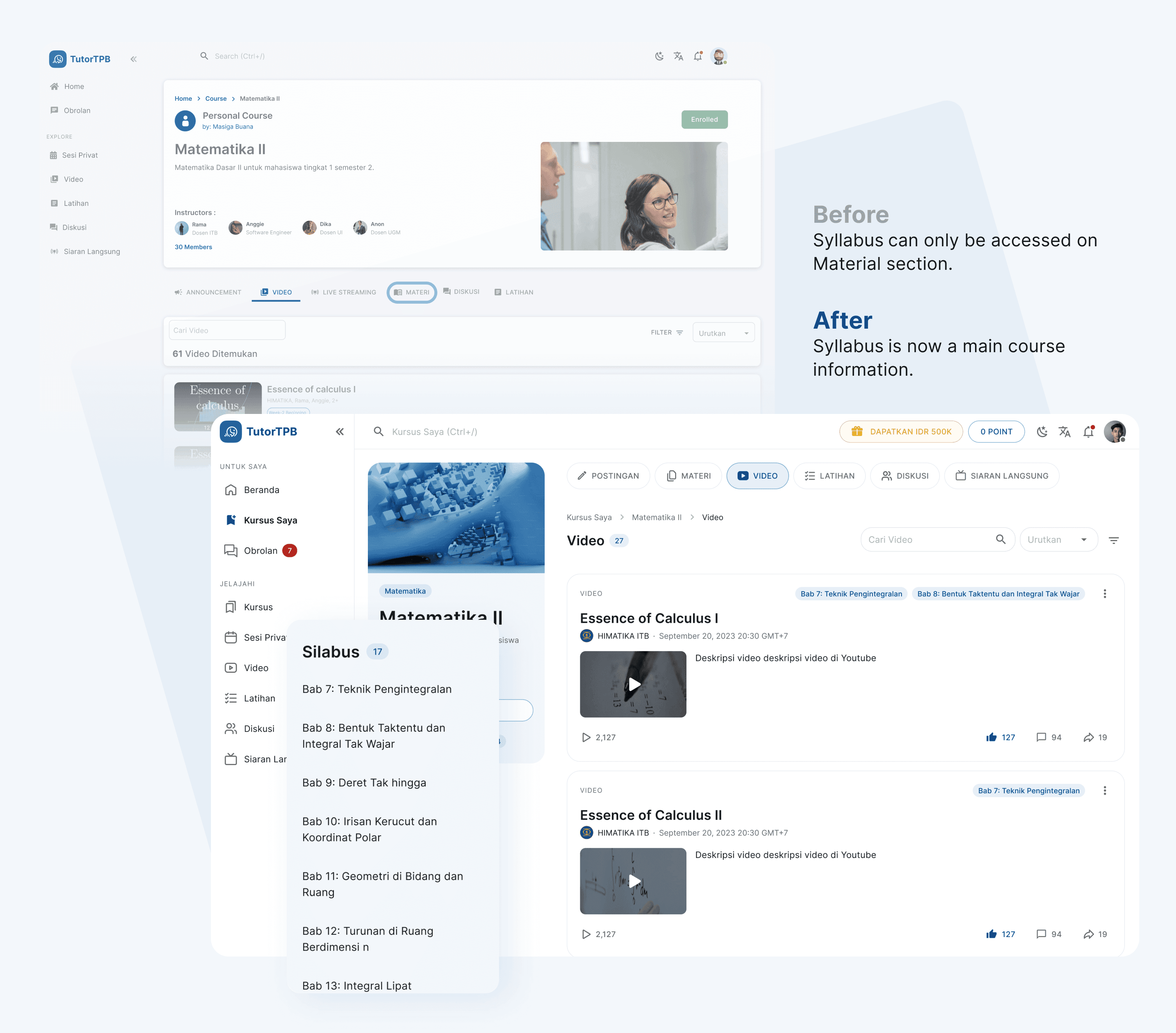
Most course content types (materials, videos, live streams, exercises) are part of the syllabus, but the syllabus can only be accessed from the Materials tab. Therefore, in the new design, the syllabus is accessible from any tab. This change also provides users with an overview of the course syllabus at a glance, without having to first navigate to the Materials tab.
Content Layout Standardization
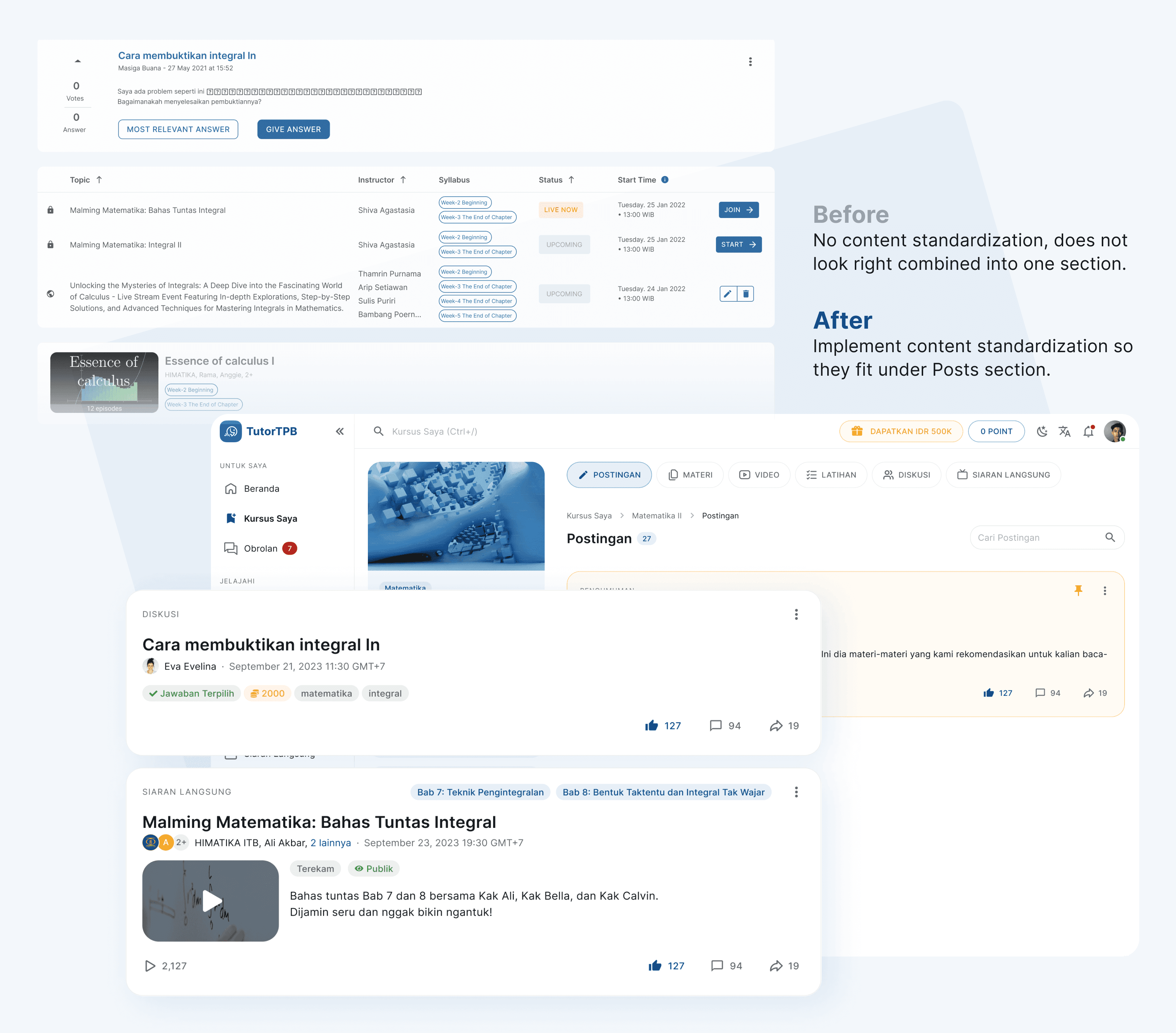
The need of course overview and recent updates can be solved by combining existing Announcement as the main section to also accommodate all type of contents, named Posts section. With the addition of a new tab called Posts, where users can view all content added to a course chronologically, there is a need to standardize the layout of content entries, which previously varied greatly, to ensure a cohesive display on one page.
Above the Fold Course Contents

Addressing user insights that the course layout was ineffective (the banner height exceeded half the screen, causing the course content to be less visible), the banner was reduced in size and aligned horizontally with the content, which was moved upward for better content visibility.
Personalize Dashboard
The dashboard which previously contained a mix of existing courses, is now divided into sections for courses the user has joined (as well functioned as a reminder of ongoing courses) and recommended courses (other courses). Each course section directs users to a dedicated page to view all available courses respectively.
Sidebar Menu Grouping
With the introduction of a personalized dashboard, it is now easier to group menus in the sidebar. I separated menus related to user ownership (Dashboard, My Courses, Chat) from exploration menus (Courses, Private Sessions, and others).
Outcome
User testing to assess the usability of the new interface is still ongoing. However, due to a streamlined design process that consistently aligns with the business goals of the product owners, they have expressed satisfaction and believe that the new interface is superior in terms of design and ease of use.